Product table tutorial

  • Create table with preset
  • Change the table columns
  • Modify table navigation
  • Customize table styling

Difficult: Beginner 😊
Time required: 10 minutes 🚀

In this tutorial we’ll be creating a product table to show our woocommerce shop’s auto-parts products in a smart table layout. This tutorial is designed to be super simple so that anyone with a woocommerce shop can easily follow along.

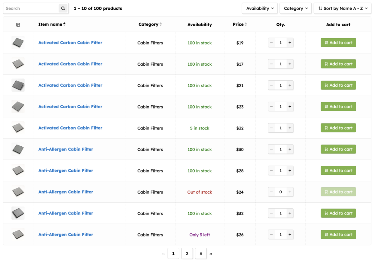
Our final woocommerce product table will look like this:

After you’ve completed this tutorial you’ll be able to setup similar excellent product tables for your shop and customize them based on your specific requirements. If you wish you may proceed to more advanced tutorials for more complex layouts and features.

Ensure your products are ready

Before we begin please ensure your woocommerce products have all the properties that we wish to show in our new product table:

  • Name
  • Featured image
  • Price
  • Availability / stock
  • Category

Here’s an example of an auto-parts product from our tutorial site with all the above mentioned properties:

Install the product table plugin

To create a woocommerce product table you need to have one of our product table plugins installed and activated on your site:

  1. WooCommerce Product Table PRO: This is the PRO version of our plugin with premium features for the best product tables.
  2. Product Table & List Builder for WooCommerce: This is the free version of our product table plugin with solid starter facilities.

While we recommend the PRO version of our plugin for its exclusive, premium features, you can use either of the two plugins to follow along with this tutorial.

Once you’ve ensured your woocommerce products are ready and you’ve installed our plugin, you’re all set to create a new product table for your shop.

Create new product table

To create a new product table go to your admin dashboard wp admin → product tables → add new table

Select a table preset

A presets screen will open up where we can select a product table preset that is closest to our requirement. The preset called ‘Table with description’ has most of the product table columns that we require. We just need to replace its ‘description’ column with new category and stock columns. So lets use this preset to create our new product table by clicking on it.

Table editor introduction

This leads us to our product table editor page where the settings of our preset product table have already been loaded in.

Following are the main sections on this table settings page:

  1. At the very top we have plugin resource links to help you if you get stuck or if you generally wish to explore further information about the plugin.
  2. Then we have the table name and shortcode. You can change the table name if you want. And use the shortcode anywhere on your site to view your product table.
  3. Below that you have some information about the table preset that you’ve used to create the current table. This message can be dismissed.
  4. Next we have the table settings tabs where you can configure various aspects of the product table:
    • Query: Choose which products will be displayed in the product table.
    • Columns: Setup the columns and product information you wish to display in the table.
    • Navigation: Configure the search and filtering options for your product table.
    • Style: Modify colors, sizes, borders etc to fine tune your table design.
  5. And at the very bottom we have the save settings button that can also be triggered by pressing Cmd/Ctrl + s on your keyboard.

Preview the product table

Let’s preview our new product table on our site. For this, copy the the table shortcode from the top of the settings page. Then create a new page on your site and paste the table shortcode on it to view the table on the frontend. Your new product table will look similar to this:

This table was created based on the settings of the preset we selected called ‘Table with description’. Later in this tutorial we’re going to replace the ‘description’ column in this table with new ‘category’ and ‘availability’ columns.

Note: You will see a link labeled ‘Edit table’ below the product table, toward the left. This helpful link lets you quickly jump to the settings of any product table from the frontend. It is visible only to the site admin and will be hidden from site visitors.

Select product category for the table

The very first tab is titled ‘Query’. Here we can set criteria for the products that should be displayed in our table. In the category settings of this tab we’ve selected the ‘Auto-parts’ category to show products from that category in our table.

Edit the table columns

The next tab is titled ‘Columns’. Here we can set the columns for our product table.

At the top we have tabs for laptop, tablet and phone device types. These tabs allow us to create different sets of columns and layout to suit different screen sizes.

Note: For most sites we recommend setting up only the laptop and phone columns. Tablet columns will be inherited from laptop columns if you simply leave the tablet columns section empty.

Within the laptop column settings we can see that our preset product table already has 6 columns pre-configured. And the settings of the first column titled ‘image’ have been opened up.

As we’ve mentioned above, we want to replace the ‘description’ column in this table with 2 other new columns showing product ‘category’ and ‘availability’ (or stock).

So click on the ‘description’ column button to open that column’s settings. Then click the ‘delete’ button at its top right (trash icon) to remove this column from our table.

To add a new column we can use the blue ‘+ Add column’ button which will create a blank new column that we can configure to show any product property we want.

However, for common product table columns like category, availability etc, the plugin already provides preset columns. Instead of creating a brand new column, let’s make use of this preset columns facility.

Click the the dropdown icon next to the ‘+ Add column’ button to show a list of the available preset table columns. Then select the ‘Category’ column to add it to the table.

Our new ‘category’ column will be added at the end of the table. We can drag the new ‘category’ column button and reposition it next to the ‘name’ column.

In this same way we can add the ‘Availability’ or ‘Stock’ column to our table from the preset columns list and and place it next to the category column.

Note: The ‘Availability’ column is a PRO version exclusive feature. If you’re using the Lite version of our product table plugin then you can use the ‘Stock’ column instead.

Let’s save our table setting and preview our table changes on the front end (on the same page where we copy pasted the table shortcode earlier). We can see that our table columns have changed based on our new settings. The ‘description’ column is gone and in its place we now have the new ‘category’ and ‘availability’ columns.

Edit table elements

We are now going to see how to modify the elements in the product table. Whenever you wish to change the setting of any element in the product table, first identify in which column the element is placed. Then open that column’s setting in the editor. And then click on the element in the editor. This will open a popup showing the element’s settings.

For example let’s say we need to change the settings of the image element in our product table. What we want is that if visitor hovers on the product image, a magnified version of the image should appear next to it, and if the visitor clicks on the image then a larger version of the image should appear in a light box.

Here is a video demonstration of editing the table’s product image element and steps by step guide below it:

  1. First we identify that the product image element seems to be in the first column in the table.
  2. Next we’ll open the settings of the product table. There is a link labeled ‘Edit table’ under every product table on the front end which is only displayed for the site administrator. By clicking this link you can quickly jump to the settings of the product table.
  3. In the settings of the table we open the ‘Columns’ tab and then in ‘Laptop columns’ we open the very first column labeled ‘image’. And in its cell template we open click the ‘Product image’ element to open its settings
  4. Now a popup opens with the settings of the ‘Product image’ element. We change the settings in this popup based on your requirement. We switch ‘Action on click’ to open image in lightbox and we enable the option that says ‘Show magnified version of image on hover’.
  5. After saving our table settings we check on the frontend and the table’s product image element now shows larger version on hover and opens up in lightbox on click.

In the same way we can change the settings of our quantity element to make it show +/- buttons on the edges.

For this we first open the column settings in the table editor that contains the ‘Quantity’ element.

Then we click on the ‘Quantity’ element in the column cell template to open it’s settings.

In the ‘Quantity’ elements settings popup we enable the option to show the + / – buttons on the left and right (PRO version facility).

And accordingly on the frontend our quantity input now has + / – buttons on its edges.

Edit table phone columns

Our product table already has preset phone columns. And we can further edit the phone column view based on our requirements.

To view the phone layout of the product table first go to the page with the product table preview. Then you can follow either of these 2 ways to check the table in phone view:

  1. Either narrow down the browser widow.
  2. Or use Google Chrome (or other browser) inspector tool to simulate mobile view. We demonstrate this in the following video:

As you can see in the phone view we have 2 columns. In the left side column contains only the product image. The right side column contains all other product details. In the following image we’re drawing a line in between the two columns to help you identify them.

Notice in the preset phone view of our product table we have product description and no availability or category information. Just like the laptop view of our product table, we would like to replace the product description with category and availability information in the phone view as well.

So let’s edit the table’s phone columns. Go to the table settings → columns → phone columns. Here you can see we have 2 pre-made columns:

  1. Image: This column contains a ‘Product image’ element.
  2. Details: This column contains all other product information.

While the ‘image’ column is simple, the ‘details’ column is interesting with several product property elements arranged in multiple rows.

Our product table plugin lets you create multiple nested rows within a column and add multiple elements within these rows. That’s how this layout was created. And we can completely edit this layout based on our requirements.

Since we don’t want the ‘Short description’ element in our product table lets start by deleting it. To do this by click the ‘short description’ element and its settings popup will appear. On the top right of this popup you can see a delete button that you can click to remove this element. Here’s a video demonstration of how to delete the element:

Instead of this element we want to show the product category. To add a new element in the same row where we deleted the ‘short description’ element click the ‘+ Add element’ button.

This will open a popup showing a long list of elements you can add to the column. Click the ‘Category’ element to add it.

When you click the ‘Category’ element immediately its settings will open up. Simply click outside of this new element’s settings and you’ll find that it has been added to the column.

If we save our settings and preview our product table in another window we can see that the product description has been replaced with product category.

Now let’s add the ‘Availability’ or ‘Stock’ element next to our ‘price’ element in the same column. For this we need to click the ‘+ Add element’ button next to the ‘Price’ element and select the new element we want to add to the column.

And on the front end we can see that product availability information is now added next to the product price.

However, right now the price and availability elements are too close together. There are two ways that we can add some space between them:

  1. Add the ‘Space’ element between them.
  2. Add the ‘Stick separator’ element between them.

Let’s add the ‘Stick separator’ element after the ‘Availability’ element and then drag and re-position it between the other two elements.

Accordingly on the front end you’ll see a stick separator between the price and availability elements creating a very neat arrangement.

Customize table style

Our product table column layout is now complete so let’s look into applying custom styles on our product table. For this go to the ‘Style’ tab in the table editor.

You’ll find 4 tabs in there. The ‘Laptop’, ‘Tablet’ and ‘Phone’ tabs help you apply different styling based on device size and the ‘Navigation’ tab helps you style the table navigation elements.

When you first open the ‘Style’ tab the ‘Laptop’ tab will be open in it by default.

Note: The ‘blue dots’ in the table editor indicate there are user settings in the tab or section. This helps you conveniently keep track of your settings without needing to open all settings.

In the ‘Laptop’ tab you’ll find several sub-sections that contains style settings options for various parts of the product table.

For example in the ‘Odd rows’ and ‘Even rows’ section you can configure the table row background and hover colors.

In the ‘Table borders’ section you can change how the table borders look (inner and outer) and the table corner roundness.

But the most important is the ‘Inner elements’ section. This section contains settings for several product table elements like the Product image, Title, Add to cart button, Quantity input, Price etc.

To edit the style settings of any table element simply open its corresponding section here and configure options. For example here we’re change the ‘Add to cart button’ background:

In this way we can customize the styling of each and every part of our product table to make it match our own store’s branding and design aesthetic.

Configure navigation options

Lastly, let’s see how to edit the navigation options of our product table. For this open the ‘Navigation’ tab of the product table.

Within the ‘Navigation’ settings tab we have multiple sub-section:

  1. Sidebar: We can add elements here that we want to show in the table sidebar. Leave empty to hide the sidebar.
  2. Header above table: Elements added here are going to appear above the product table. Within this area we can also create multiple nested rows and nested column within those rows.
  3. Responsive navigation: If we leave this section empty the plugin auto-configures the navigation options on phones based on laptop navigation setup.
  4. Other navigation settings: There are several other navigation options grouped here such as pagination, adaptive filtering, lazy load, etc.

For our tutorial table we wish to adjust only the navigation header above the table. We’ll leave the sidebar empty and we won’t change the responsive navigation section settings here.

Navigation header structure

Currently our table’s navigation header section has 2 rows above the product table:

  • Row 1: The first row is further split into 2 columns:
    • The left hand side column has the ‘Result count’ element which prints text informing shoppers about the number of results found
    • The right side column has the ‘Category filter’ and ‘Sort by’ dropdown elements.
  • Row 2: The second row in the navigation header has a single element titled ‘Clear filters’. This element doesn’t appear on the front end unless viewer has selected some filters. Any visitor selected filters are going to be printed in this ‘Clear filters’ element.

Below we’ve added lines on the front end navigation area to show you this row-column split. As you can see the navigation elements on the front end also follows the same structure:

Note: In the above example we’ve applied some category filters via the category filter dropdown on the right hand side. We did this to make the clear filter options appear otherwise the second row would be hidden.

Modifying navigation elements

Let’s look into modifying the settings of these elements.

The ‘Result count’ element prints the number of results found and the group of results being displayed for current page. For example it may shop messages like:

  • Showing 1 – 10 of 100 results
  • Showing all 5 results
  • No results found

We can modify these messages by changing the the text templates used by the ‘Result count’ element. For this click the ‘Result count’ element to open its settings popup.

In the settings of the ‘Result count’ element you’ll find option to modify the text templates used for its messages. You can change any of these and the messages on the front end will be modified accordingly.

For example if we changed the ‘Result count message’ template from

Showing [first_result] – [last_result] of [total_results] results

to:

[first_result] – [last_result] of [total_results] products

Then on the frontend instead of saying:

Showing 1 – 10 of 100 results

it would say:

1 – 10 of 100 products

Now we know how to edit the settings of our navigation elements. Just click the navigation element and its settings popup will appear. You can modify the element’s settings there.

Adding elements to table navigation

Next, let’s see how to add new elements to the navigation header. We’re going to add 2 new elements:

  1. A new ‘Search’ element on the left side column.
  2. A new ‘Availability filter’ element in the right side column.

Next, let’s add a ‘Search’ field before the ‘Result count’ element. For this, click the ‘+ Add element’ button next to it.

This will open a popup with various elements that you can add to the table navigation. Click on the ‘Search’ element to add it.

Then click outside its settings popup to close it. You’ll find that the ‘Search’ element has been added to the navigation header. Drag and position it before the ‘Result count’ element.

In the same way add the ‘Availability filter’ element in the right hand side column and position it as the first element.

Now we have successfully modified our table navigation header with new ‘Search’ and ‘Availability filter’ elements as we wanted.

Tutorial completed!

And that’s all for this tutorial! By following along you’ve successfully created and customized a woocommerce product table for your shop. We recommend using the lessons from this tutorial to experiment and create more customized product tables. We hope you enjoyed this tutorial. In case you got stuck anywhere feel free to reach out to us via the support form.

For more information please see:
Tutorials | Documentation | FAQs

Navigation UI

  • Customize navigation elements
  • Create a left navigation sidebar
  • Responsive navigation for phones

Aim: Create a smart navigation system for your table. Learn how to add navigation elements above and to the left of the table. Also make the navigation fully responsiveness so that it is convenient to use on phones as well.

WooCommerce Product Table tutorial 4

Header & Left sidebar

Sort By filter

Category filter

Price filter

Clear Filters

Dropdown width

Responsive navigation

Basics tutorial 2/2 [OLD]

  • Create attribute and custom field columns
  • Add an AJAX add to cart button

We recommend viewing our new product table tutorial instead. This tutorial is kept here for legacy purposes only.

Aim: Complete our table from Tutorial 1. Add attribute, custom field, navigation and AJAX add to cart.

Your finished product table will look similar to the one below.

WooCommerce Product Table tutorial 2

Before we begin, please ensure:

  • You have followed tutorial 1, and are comfortable applying the concepts covered in that tutorial. We will be extending the table from Tutorial 1 in this tutorial.
  • The products you wish to show in your table have at least one attribute and custom field each so that you may display those in your tale as well.

Video overview

Below is a quick video overview of this tutorial. In case you get stuck at any time, this video should help visually clarify the tutorial flow.

Adding ‘Attribute’ element

  • Duplicate the second column (the title column) and in the duplicated column change the ‘Heading’ text to ‘Attr 1’.
  • In the ‘Cell template’ of this duplicated column, remove the ‘Title’ element and instead, add an ‘Attribute’ element.
  • In the ‘Element Editor’ screen of this ‘Attribute’ element select the attribute you wish to show. Then click outside the screen to add the element to your column.
  • If you wish to add more attribute element columns, just duplicate this column and modify the duplicate to show the other attributes.

Adding ‘Custom Field’ element

  • Duplicate the attribute column and change the duplicated column’s heading text to CF 1
  • In the ‘Cell template’ of this duplicated column, remove the ‘Attribute’ element and instead, add a ‘Custom Field’ element.
  • In the ‘Element Editor’ screen of this ‘Custom Field’ element enter the custom field name that you wish to display. Then click outside the screen to add the element to your column.
  • If you wish to add more custom field element columns, just duplicate this column and modify the duplicate to show the other custom fields.

‘Add to Cart’ button and ‘Quantity’

  • Focus on the last column that displays the Buy Here button.
  • In the ‘Cell Template’ of this column add a ‘Quantity’ element. Drag this element and place it before the ‘Button’ element.
  • Open the ‘Button’ element, change its Label > Text: “Buy here” to “Add to cart”
  • Select the ‘Button’ element’s link to be ‘Add to cart via AJAX’.

Navigation elements

  • Open the ‘Navigation’ tab of the editor.
  • Under ‘Header’ section add a new row. Select ‘Left and Right columns’ for this row so that it is divided into 2 parts (this is the default option).
  • In the left column add the element ‘Result Count’.
  • In the right column add the element: ‘Sort By’.

Responsive design

  • If you are using the table from Tutorial 1, the ‘Phone Columns’ section should already have 2 column. 
  • The first column displays the product image
  • For the second column, add new rows to include the attriute and custom field columns that we have created. You can use text labels for the elements.
  • Use the image below as a reference point.

Save your table settings and we’re done!

  • Save the table settings using the ‘Save settings’ button at the bottom right of the page. Or you can use the keyboard shortcut Ctrl or Cmd + S to quickly save your table editor settings.
  • Now view your table on the front-end of the site and you’ll find it is updated according to the changes we made.

Basics tutorial 1/2 [OLD]

  • Create columns and add elements to them
  • Make the table responsive – mobile friendly

We recommend viewing our new product table tutorial instead. This tutorial is kept here for legacy purposes only.

Aim: Quickly understand the basics of WooCommerce Product Table.

By the end of this tutorial you will be ready to create your own custom product tables.

Your final simple product table will look similar to the one below.

WooCommerce Product Table tutorial 1

Before we begin, please ensure:

  • WooCommerce Product Table plugin is installed on your site, and the ‘Product Tables’ menu item appears in the dashboard menu.
  • WooCommerce is installed on your website, and you have basic understanding of how to use WooCommerce.
  • You have at least one product category setup on your site. And there are a few products in the category that you will show in this table.
  • For this tutorial, each of the products should have –
    • Title
    • Featured image
    • Price
    • Rating (optional)
  • If any of these fields are missing (such as rating), they will not show up in our product table.

Creating a new WooCommerce Product Table

  • Go to Admin dashboard > Product Tables > Add New Table.
  • This will create a new empty product table for you and take you to its editor page.
  • At the top of the table editor page you will find an option to give your new table a name. Enter ‘Tutorial’ or any name of your choice.
  • Below it you will find the shortcode for displaying your new table.
  • Below that you can see the Editor, with its 4 tabs:
    • Query: Here you can control which products will be displayed in this table.
    • Columns: The table columns are setup in this tab.
    • Navigation: Controls navigation elements like filters, sorting, and result count.
    • Style: Overall and default design options for various parts of the table.
  • In the Query tab of the editor (which is open by default) select a product category you wish to display. 

Creating table columns

  • Now open the ‘Columns’ tab of the editor.
  • The ‘Columns’ tab is divided into 3 sections:
    • Laptop Columns *required*
    • Tablet Columns *optional*
    • Phone Columns *optional*
  • Each of these 3 sections can have a unique set of table columns. 
  • Columns that are created under the ‘Laptop Columns’ section will be displayed as the default columns for your product table across all device sizes. Tablet and Phone columns are optional and allow you to create table columns targeted specifically at those device groups.
  • For now we will be working with ‘Laptop Columns’.
  • In the ‘Laptop Columns’ section use the ‘Add a Column’ button to create 5 columns.
  • To delete any extra columns, just use the ‘X’ icon at the top right of the column settings.
  • Each column settings panel is divided into two main sections (see image below):
    • Heading: Here you can control the current column’s heading content and design. For example, if you wish to set the heading for Laptop Column 1 as ‘Title’, ‘Price’ or ‘Rating’, you would do it here.
    • Cell template: Here you can control what shows up in the column cells (other than the heading cell) and general design of the column. For example, if you wish for the first column to display product’s title, product’s price or product’s rating, you would make the required changes here. 

Adding elements to columns

  • Let’s begin with setting up the first column of our table. For this, focus on the first column you have created under the Columns tab. It is labeled ‘Laptop Column 1’ (see image below).
  • Notice the demo table at the top of this tutorial page. It’s first column displays the product image. Accordingly, we will configure the Laptop Column 1 > Cell template to display product image.
  • To do this, add a new element to the ‘Cell Template’ using the ‘+ Add Element’ button. (see image below)
  • Clicking the ‘+ Add Element’ button opens the ‘Add Element’ screen. This screen lets you select which element to add to your cell template.  Since we wish to display the product image in our first column, select the ‘Product Image’ element by clicking on it.
  • Now you will find a new screen has opened up titled ‘Edit Element: Product Image’. This is the ‘Element Editor’ screen, which lets you modify the settings for the element that you have just added. Right now, it is allowing you to edit the ‘Product Image’ element since you selected it to be added to your cell template. For now, we do not need to change any settings for this element. Simply close this screen by clicking outside the options box or the ‘X’ button at its top right.
  • When you exit the ‘Element Editor’ screen mentioned above, you will be returned to the ‘Columns’ tab of the table editor. You will also find that the ‘Product Image’ element has been added the ‘Cell Template’ of our first column.
  • You have now successfully setup the first column and it will display the product image when we view our final table later on in this tutorial.
  • Notice, that while setting up ‘Laptop Column 1’, we only worked on the ‘Cell template’ settings of the column. We did not work on the column’s ‘Heading’ settings. This is because in our final table, we do not want a heading for the first column. For the next column, however, we want a heading as well. Therefore, for column 2 we will work on setting up both – the column heading as well as cell template. 
  • Lets focus on ‘Laptop Column 2’. If you have not already created Laptop Column 2, please do so now by using the ‘Add a Column’ button beneath the columns.

  • Refer to the demo table at the top of this tutorial page. As you can see, we want the second column to have the text ‘Title’ in its heading, and the cells should show the product titles.
  • Accordingly we will first setup the column’s ‘Heading’ to show the text ‘Title’, then we will configure its ‘Cell Template’ to show product titles.
  • Setting up Laptop Column 2 > Heading:
    • Focus on Laptop Column 2’s ‘Heading’ tab (see image below).
    • Use the ‘+ Add Element’  under the ‘Heading’ tab to add an element to the heading of this column.
  • The ‘Add Column Heading Element’ screen opens up. This screen lets you choose an element to add to the column heading. Since we wish to display text in the column heading, select the ‘Text’ element.

  • The ‘Text’ element’s settings screen will now open up allowing you to setup your new text element (see image below).
  • Give it the text ‘Title’. Then close this Element Editor screen with the ‘X’ button at its top right.
  • You will now find that the ‘Text’ element has been added to the column’s ‘Heading’. This element is labeled ‘Text: “Title”‘.

  • Setting up Laptop Column 2 > Cell Template:
    • Now focus on the Laptop Column 2’s ‘Cell Template’ tab. We want the product title to appear in the cells of this column. Therefore, in the cell template we are going to add the ‘Title’ element.
    • Previously we covered how to setup the Cell Template for Laptop Column 1 in order to show product images in column 1’s cells. The process for editing the cell template of Column 2’s will be very very similar.
    • In Laptop Column 2 > Cell template click on  ‘+ Add Element’ to add an element to the cell template.
    • In the ‘Add Element To Cell Template’ screen that opens up, select the ‘Title’ element since we wish to display the product title in the cells of this column.
    • Now, the new element’s editor screen will open up. No settings need to be changed here. Simply close the screen by clicking outside of the options box or the ‘X’ button at the top right.
  • The Image below shows Laptop Column 2’s settings once it has been fully configured. The ‘Heading Tab’ has a ‘Text:”Title”‘ element, which will make the column 2 heading read ‘Title’. And the cell template tab has ‘Title’ element in it, which will make the product titles appear in the cells of column 2. 
  • Setting up the remaining 4 columns:
    • The basic process of creating a column, giving it a text heading, and adding a simple element to the cell template should now be clear. We have covered this for column 1 and 2. If the process is not clear, please review the steps above.
    • Using the same, simple logic you can create headings and cell templates for the remaining 3 columns as well.
    • Please go ahead and try settings up the remaining 3 columns with the following configuration:
      • Laptop Column 3
        • This column is supposed to show product ratings. Accordingly, this column should have the text heading ‘Rating’ and its cells should show the product ratings in the final table. 
        • Heading tab settings: Add a ‘Text’ element to the heading tab using the ‘+ Add Element’ button. In the ‘Text’ element’s settings enter ‘Rating’.
        • Cell template tab settings: Add a ‘Rating’ element using the ‘+ Add Element’ button.
      • Laptop Column 4
        • This column is supposed to show product price. Accordingly, this column should have the text heading ‘Price’ and its cells should show the product price in the final table. 
        • Heading tab settings: Add a ‘Text’ element to the heading tab using the ‘+ Add element’ button. In the ‘Text’ element’s settings enter ‘Price’.
        • Cell template tab settings: Add a ‘Price’ element using the ‘+ Add element’ button.
      • Laptop Column 5
        • This column is supposed to show the buy button. And the column should have no heading.
        • Heading tab settings: *leave empty*
        • Cell template tab settings: Add a ‘Price’ element using the ‘+ Add element’ button.
    • Your final settings for all the columns should look like this:

Save table settings

  • Use the ‘Save Settings’ button below the editor to save your new settings.
  • Please ensure you save your work often to avoid accidentally losing table data.
  • Convenient keyboard shortcut for saving:
    • PC: Ctrl + s
    • MAC:  Cmd + s
  • The keyboard shortcut works even inside the editor screens.
  • The table is saved over AJAX, without refreshing the page. But the changes won’t show up on the front end until the save process is completed on your server.

Using the table shortcode

  • Now that your columns are ready and your table is saved, you can print this table on the front-end of your website.
  • Scroll up to the top of the editor page where you will find the table shortcode.
  • Copy it and paste it on any page / post on your website, and view the results on the front end.

Setting up Phone columns

  • Large tables do not always look good when narrowed down on phone screens.
  • This is why top sites have a standard of displaying their tables differently on phones, in a layout that looks better on narrow screens. 
  • WCPT lets you conveniently setup a separate responsive layout for your table so that your tables look great on small screen devices as well. This is achieved by creating a separate set of columns in the ‘Phone Columns’ section.
  • In this part of the tutorial we will be using the Columns > Phone Columns section to create a separate set of columns which will display the our table similar to the image below.

  • For our phone layout, we will only display 2 columns in our table. As you can see in the image below, the column on the left will only display the product image. While the column on the right will display the remaining elements: title, rating, price, buy button.
  • Notice that in column 2 each of the element (title, price, rating, buy button) are placed in a separate row each. We will be covering how to create such rows within columns here.
  • On our product table editor page locate the ‘Phone Columns’ section, right underneath the ‘Laptop Columns’ section. Create 2 new columns in this section (see image below).
  • Follow the below steps to setup your two phone columns.
  • Phone Column 1:
    • Heading: We do not need a heading, so leave this empty.
    • Cell template:
      • Use the ‘+ Add Element’ button to add a new element.
      • In the ‘Add Element To Cell Template’ screen select the  ‘Product Image’ element so that it will be added to the cell template.
      • Now the ‘Element Editor’ screen for the product image will open up. Do not close it yet. We will make one change to our new ‘Product Image’ element. We will design it be larger.
      • For this, within the Element Editor screen, open the ‘Style for Element’ accordion by clicking on it (see image and video below). And set the ‘Max width’ property to ‘140px’. This will make the image large enough for our requirements.
  • Phone Column 2: 
    • In this column, we will display the remaining 4 product elements – title, price, rating, buy button. Each of these elements will be neatly presented in a separate row of its own.
    • Heading: We do not need a heading, so leave this empty.
    • Cell template:
      • At the bottom of the ‘Cell template’ you will find the ‘+ Add Row’ button which will help us create these multiple rows (see image below).
      • Use this button to create 3 additional rows, so that we have 4 rows in total, one for each element. 
      • If you have created an extra row, open the row settings with the settings button at the right end of the row and click the red delete button at the top right of the row settings (see image and video below).
  • Now, using the ‘+ Add Element’ button in each row, setup the following elements:
    • Row 1:  ‘Title’ element
    • Row 2: ‘Price’ element
    • Row 3: ‘Rating’ element
    • Row 4: ‘Button’ element

  • Save your table settings. For this, click on the ‘Save Settings’ button at the bottom of the editor or  use Ctrl/Cmd + s on your keyboard. 
  • Now if you view your product table on a phone, you will find a neat responsive presentation of your products, similar to the demo screenshot at the starting of this ‘Phone Columns’ tutorial section.