Using the ‘Select Variation’ element in the product table you can give your shoppers the option to select specific variations when purchasing a variable product, right inside the table. There are 3 different ways the product variation options can be displayed and you can choose the display type you require for your table:
- Dropdown with all the product variations listed as options
- Radio buttons for each of the possible variations
- Single radio button for each variation, manually created to be placed in separate columns
Special Note: If you want to show all the variation attribute dropdowns separately like you see on the variable product page then add the ‘Cart Form’ element in your table. On the other hand the Select Variation element described in this doc provides a single dropdown with variation attribute combined for each variation option. For example if you have a variable product with 2 variation attributes – color and size then the woocommerce product page will show 2 variation attribute dropdowns to select the variation you want. You can use the ‘Cart Form’ element to print these in the table as well. Whereas the ‘Select Variation’ element is going to print a single dropdown where each option is a variation with all attribute values listed for that variation. In many cases this combined variation dropdown will look neater. But in some cases users may prefer to print the variation dropdowns separately with the ‘Cart Form’ element.
If you have any difficulty in following along with this tutorial or are unable to achieve the final results you require, please contact me via the support form and I will assist you asap with your requirements.
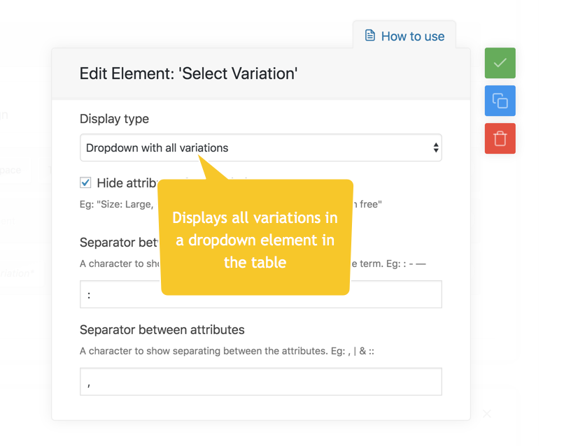
1. Variations as ‘Dropdown’
Select the ‘Display type’ to be ‘Dropdown with all variations’

You can modify the variation labels with 3 facilities –
- Hide/shop attributes in the name. Eg:
A. (attribute names displayed) Color: Red, Size: Small
B. (attribute names hidden) Red, Small - Change the separator between attribute name and terms to any valid character. Eg:
A. (using : ) Color: Red, Size: Small
B. (using :: ) Color :: Red, Size :: Small
C. (using – ) Color – Red, Size – Small, etc - Change the separator between attributes to any valid character. Eg:
A. (using /) Color: Red / Size: Small
B. (using ,) Color: Red, Size: Small
C. (using ||) Color: Red || Size: Small
2. Variations as ‘Radio buttons’


Note: Normally the radio buttons will attempt to display horizontally. However, you can give the column a fixed narrow width to force the options to display in a vertical column as above.
3. Single variation as radio button
The following steps are illustrated in the screenshots below. Please follow along the highlighted sequence of steps in the screenshot.
- Each ‘Select variation’ element is going to represent a single variation. Give this variation a name. For example ‘Small’. This name will be used by the table editor to represent this variation in the editor > column.
- Select the attributes and terms to that are part of this variation. The plugin will look through the product variations and find the closest match to these attribute – terms.
- Use the ‘Add another’ button to add more attribute – terms to the list of properties of the variation if required.
- A default template for the element is auto-created. You can modify this template to include images, icons, remove the name, etc. However keep in mind the ‘Select’ element must remain somewhere in the template to ensure the variation is selectable. This select element creates the radio button.


In the example below the column 2 in the table is made to show a product variation with Serving size (attribute): Small (term).
